No matter how well-planned your marketing efforts are, a well-designed website remains the core of any digital business. Not only from an aesthetic point of view, it is also vital for SEO, traffic generation, branding and of course conversions. So unless your website is up-to-date with the current trends in the market, you cannot expect to make a difference.
So, here a glimpse of the current trends in web design that will give you a competitive edge.
The Background:
Big background image with rich typography is the thing you should try in 2015. However, there are certain factors that you should take into consideration. Don’t let the background overpower, rather let it fall in line with your brand. The theme should be consistent throughout the website and also the backgrounds should not slow down the site. Make sure they download quickly without any glitch. Place of text is another important factor to be considered. Text should be placed in such a way that it’s easy to read.
Professional Quality Custom Photography:
If you had relied on stock imagery for your design purposes, then now is the time to switch to professional photography. Custom photography with the website and company theme in mind will give your website design a unique touch. Rest assured you will not have to worry about coming across the same images in other websites.
Long Scrolling Websites:
The trend that has become a hot favourite of many is long scrolling websites. Contrary to the popular belief that shorter the better, popular companies like Apple have tried and succeeded in long web pages concept. Earlier, long scrolling websites were frowned upon, but it will now work in your favour. The primary reason: users shifting from desktops to mobiles devices for web browsing. So, it becomes easier to scroll down sites, rather than clicking on different links to navigate from one page to another.
Responsive Web Design:
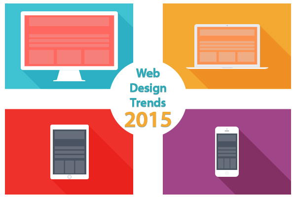
In the year 2015, a responsive design will be more of an essential element, rather than a trend. With more and more people using mobile devices for purchases and other transactions, designers will have to adopt a way to make your website fully customisable for different viewpoints. The most important point to remember is that every device has specific requirements and your site should be well equipped to reflect the same on all devices.
Ghost Buttons:
Buttons have not been given their due in the past, and the year 2015 will be the year to acknowledge their true potential. It will be their comeback year with new designs and new functionalities. Usage of Ghost Buttons is expected to top the list. Minimal and stylish, these buttons come with subtle hover animation.
Storytelling in Design:
The concept of storytelling in design is something everyone should experiment. This concept is a powerful tool that can convert visitors into potential customers. Putting together a story that explains your service makes customers relate to your company and also builds an emotional attachment.
Usage of Animation Elements:
Lot of web designers have started using subtle animations on buttons and off screen elements. This is one trend you can expect to see a rise in 2015. Animation will be a key pillar for any web, mobile or software app. Subtle, well-managed animation will not only delight users, but will also guide them and provide context. However, remember that too much of animation or jarring transitions can actually work against you. So, make sure you maintain the balance.
Hidden Menus:
Hidden menus are gaining popularity by the day. Menus have always been a staple in any web design and no one questioned the inclusion of menus on the home page. But, now designers are experimenting by hiding navigation off screen. Only when the user interacts with an element on the top right or left of the screen, does the menu show up. Hidden menus come in handy especially when viewing on a small screen. It will not interrupt the shopper when he is doing more than just navigation.
While, it is good to keep yourself updated with the latest trends, it certainly doesn’t make sense to just mimic what everyone else is doing. So, make sure you learn from the various techniques and strategies that other designers are adopting, but use the one that you think will make a difference.